<?xml version="1.0" encoding="utf-8"?><feed xmlns="http://www.w3.org/2005/Atom" ><generator uri="https://jekyllrb.com/" version="3.10.0">Jekyll</generator><link href="/gai/feed.xml" rel="self" type="application/atom+xml" /><link href="/gai/" rel="alternate" type="text/html" /><updated>2026-07-06T00:53:10+00:00</updated><id>/gai/feed.xml</id><title type="html">钙’s personal blog</title><subtitle>I&apos;m the Gai, and I won&apos;t tell you who am I, but I will tell you what I like.  I like programming, and I like to share my knowledge with others.  This is my personal blog, where I will share my thoughts and experiences  on programming and other topics that interest me.</subtitle><author><name>钙</name></author><entry><title type="html">A Date Picker Component in QML</title><link href="/gai/date-picker/qml/2026/07/01/QML-Date-Picker.html" rel="alternate" type="text/html" title="A Date Picker Component in QML" /><published>2026-07-01T22:00:00+00:00</published><updated>2026-07-01T22:00:00+00:00</updated><id>/gai/date-picker/qml/2026/07/01/QML-Date-Picker</id><content type="html" xml:base="/gai/date-picker/qml/2026/07/01/QML-Date-Picker.html"><![CDATA[<p>There are different approaches to building date picker components in a user interface. For example, Qt6 provides the <a href="https://doc.qt.io/qt-6/qml-qtquick-controls-monthgrid.html">MonthGrid</a> component, which looks like a calendar: to pick a date, the user selects a year and month and then taps a day in the grid. A more modern approach is based on three spinning wheels — one each for the year, month, and day. This reduces the need for precise clicks: the user can swipe, drag, or scroll the mouse wheel without worrying about exact pointer placement, making date selection faster and more comfortable. The component works equally well in desktop, web, and mobile applications.</p>

<p>A ready-made solution is available in the <a href="https://felgo.com/doc/felgo-datepicker/">Felgo</a> component library — if you are comfortable pulling in a large third-party dependency with many tightly coupled components. But if you need a minimal yet fully functional implementation that can be dropped straight into your project, this article is for you.</p>

<p>If you prefer to jump straight to the code, head over to the <a href="https://github.com/Alouettesu/qml-date-picker">repository</a>. Otherwise, read on — I will explain how the component works and how to build on top of it.</p>

<h2 id="spinningwheel--the-base-spinning-wheel-component">SpinningWheel — the base spinning wheel component</h2>

<p>The foundation of the picker is the <code class="language-plaintext highlighter-rouge">SpinningWheel</code> component. It implements a single spinning wheel that displays arbitrary data. The user can select an item by clicking, scrolling, or dragging. The component accepts any type of data model: numeric, <code class="language-plaintext highlighter-rouge">ListModel</code>, JavaScript array, or <code class="language-plaintext highlighter-rouge">QAbstractItemModel</code>, and supports custom background, highlight, and delegate components. For numeric models and JavaScript arrays the default delegate is sufficient. For more complex models such as <code class="language-plaintext highlighter-rouge">ListModel</code> or <code class="language-plaintext highlighter-rouge">QAbstractItemModel</code> — which expose multiple roles — a custom delegate is required. Let us look at examples using each model type.</p>

<p>All components are part of the Gai QML module, which lives in the imports/Gai folder of the repository.</p>

<h3 id="spinningwheel-properties">SpinningWheel properties</h3>

<ul>
  <li><code class="language-plaintext highlighter-rouge">model: var</code> — Data model (numeric, JavaScript array, <code class="language-plaintext highlighter-rouge">ListModel</code>, or <code class="language-plaintext highlighter-rouge">QAbstractItemModel</code>).</li>
  <li><code class="language-plaintext highlighter-rouge">currentIndex: int</code> — Currently selected index, zero-based.</li>
  <li><code class="language-plaintext highlighter-rouge">delegate: Component</code> — Delegate for rendering items. The default delegate renders a <code class="language-plaintext highlighter-rouge">Text</code> element.</li>
  <li><code class="language-plaintext highlighter-rouge">highlight: Component</code> — Component used to highlight the current item.</li>
  <li><code class="language-plaintext highlighter-rouge">background: Component</code> — Background component.</li>
  <li><code class="language-plaintext highlighter-rouge">font: font</code> — Font used by the default delegate.</li>
</ul>

<h3 id="spinningwheel-signals">SpinningWheel signals</h3>

<ul>
  <li><code class="language-plaintext highlighter-rouge">activated(int index)</code> — Emitted when the user changes the current selection. Not emitted when the selection is changed programmatically.</li>
  <li><code class="language-plaintext highlighter-rouge">currentIndexChanged</code> — Emitted whenever the current selection changes, whether by the user or programmatically.</li>
</ul>

<h3 id="a-simple-wheel-with-a-numeric-model">A simple wheel with a numeric model</h3>

<p>With a numeric model the default delegate renders numbers from <code class="language-plaintext highlighter-rouge">0</code> to <code class="language-plaintext highlighter-rouge">N-1</code>, where <code class="language-plaintext highlighter-rouge">N</code> is the value of the <code class="language-plaintext highlighter-rouge">model</code> property.</p>

<div class="language-qml highlighter-rouge"><div class="highlight"><pre class="highlight"><code><span class="kt">SpinningWheel</span> <span class="p">{</span>
    <span class="nl">id</span><span class="p">:</span> <span class="kd">wheel1</span>
    <span class="nl">font</span><span class="p">:</span> <span class="nx">Qt</span><span class="p">.</span><span class="nx">font</span><span class="p">({</span> <span class="na">family</span><span class="p">:</span> <span class="dl">"</span><span class="s2">Arial</span><span class="dl">"</span><span class="p">,</span> <span class="na">pointSize</span><span class="p">:</span> <span class="mi">14</span> <span class="p">})</span>
    <span class="nl">model</span><span class="p">:</span> <span class="mi">10</span>
<span class="p">}</span>
</code></pre></div></div>

<p>The delegate, background, and highlight are all optional. If omitted, the defaults are used.</p>

<h3 id="a-wheel-with-a-javascript-array-model">A wheel with a JavaScript array model</h3>

<p>With an array model every element of the array is placed on the wheel.</p>

<div class="language-qml highlighter-rouge"><div class="highlight"><pre class="highlight"><code><span class="kt">SpinningWheel</span> <span class="p">{</span>
    <span class="nl">id</span><span class="p">:</span> <span class="kd">wheel2</span>
    <span class="nl">font</span><span class="p">:</span> <span class="nx">Qt</span><span class="p">.</span><span class="nx">font</span><span class="p">({</span> <span class="na">family</span><span class="p">:</span> <span class="dl">"</span><span class="s2">Arial</span><span class="dl">"</span><span class="p">,</span> <span class="na">pointSize</span><span class="p">:</span> <span class="mi">14</span> <span class="p">})</span>
    <span class="nl">model</span><span class="p">:</span> <span class="p">[</span><span class="dl">"</span><span class="s2">Apples</span><span class="dl">"</span><span class="p">,</span> <span class="dl">"</span><span class="s2">Pears</span><span class="dl">"</span><span class="p">,</span> <span class="dl">"</span><span class="s2">Bananas</span><span class="dl">"</span><span class="p">,</span> <span class="dl">"</span><span class="s2">Peaches</span><span class="dl">"</span><span class="p">,</span> <span class="dl">"</span><span class="s2">Grapes</span><span class="dl">"</span><span class="p">,</span> <span class="dl">"</span><span class="s2">Watermelon</span><span class="dl">"</span><span class="p">]</span>
<span class="p">}</span>
</code></pre></div></div>

<h3 id="a-wheel-with-a-listmodel">A wheel with a ListModel</h3>

<p>When using a role-based model (<code class="language-plaintext highlighter-rouge">ListModel</code> or <code class="language-plaintext highlighter-rouge">QAbstractItemModel</code>) the default delegate cannot render the items correctly, so a custom delegate is required. In the example below the model has two roles; they are accessible in the delegate as <code class="language-plaintext highlighter-rouge">model.role_name</code>.</p>

<div class="language-qml highlighter-rouge"><div class="highlight"><pre class="highlight"><code><span class="kt">SpinningWheel</span> <span class="p">{</span>
    <span class="nl">id</span><span class="p">:</span> <span class="kd">wheel3</span>
    <span class="nl">font</span><span class="p">:</span> <span class="nx">Qt</span><span class="p">.</span><span class="nx">font</span><span class="p">({</span> <span class="na">family</span><span class="p">:</span> <span class="dl">"</span><span class="s2">Arial</span><span class="dl">"</span><span class="p">,</span> <span class="na">pointSize</span><span class="p">:</span> <span class="mi">14</span> <span class="p">})</span>
    <span class="nl">model</span><span class="p">:</span> <span class="kt">ListModel</span> <span class="p">{</span>
        <span class="kt">ListElement</span> <span class="p">{</span> <span class="nl">emoji</span><span class="p">:</span> <span class="dl">"</span><span class="s2">🍎</span><span class="dl">"</span><span class="p">;</span> <span class="nl">label</span><span class="p">:</span> <span class="dl">"</span><span class="s2">Apple</span><span class="dl">"</span>  <span class="p">}</span>
        <span class="kt">ListElement</span> <span class="p">{</span> <span class="nl">emoji</span><span class="p">:</span> <span class="dl">"</span><span class="s2">🍐</span><span class="dl">"</span><span class="p">;</span> <span class="nl">label</span><span class="p">:</span> <span class="dl">"</span><span class="s2">Pear</span><span class="dl">"</span>   <span class="p">}</span>
        <span class="kt">ListElement</span> <span class="p">{</span> <span class="nl">emoji</span><span class="p">:</span> <span class="dl">"</span><span class="s2">🍌</span><span class="dl">"</span><span class="p">;</span> <span class="nl">label</span><span class="p">:</span> <span class="dl">"</span><span class="s2">Banana</span><span class="dl">"</span> <span class="p">}</span>
        <span class="kt">ListElement</span> <span class="p">{</span> <span class="nl">emoji</span><span class="p">:</span> <span class="dl">"</span><span class="s2">🍑</span><span class="dl">"</span><span class="p">;</span> <span class="nl">label</span><span class="p">:</span> <span class="dl">"</span><span class="s2">Peach</span><span class="dl">"</span>  <span class="p">}</span>
        <span class="kt">ListElement</span> <span class="p">{</span> <span class="nl">emoji</span><span class="p">:</span> <span class="dl">"</span><span class="s2">🍇</span><span class="dl">"</span><span class="p">;</span> <span class="nl">label</span><span class="p">:</span> <span class="dl">"</span><span class="s2">Grapes</span><span class="dl">"</span> <span class="p">}</span>
        <span class="kt">ListElement</span> <span class="p">{</span> <span class="nl">emoji</span><span class="p">:</span> <span class="dl">"</span><span class="s2">🍓</span><span class="dl">"</span><span class="p">;</span> <span class="nl">label</span><span class="p">:</span> <span class="dl">"</span><span class="s2">Berry</span><span class="dl">"</span>  <span class="p">}</span>
    <span class="p">}</span>
    <span class="nl">delegate</span><span class="p">:</span> <span class="kt">Item</span> <span class="p">{</span>
        <span class="nl">width</span><span class="p">:</span> <span class="nx">parent</span> <span class="p">?</span> <span class="nx">parent</span><span class="p">.</span><span class="nx">width</span> <span class="p">:</span> <span class="mi">0</span>
        <span class="nl">height</span><span class="p">:</span> <span class="nx">parent</span> <span class="p">?</span> <span class="nx">parent</span><span class="p">.</span><span class="nx">height</span> <span class="p">:</span> <span class="mi">0</span>
        <span class="kd">property</span> <span class="kt">color</span> <span class="nl">textColor</span><span class="p">:</span> <span class="dl">"</span><span class="s2">#222</span><span class="dl">"</span>
        <span class="kt">Row</span> <span class="p">{</span>
            <span class="nl">anchors.centerIn</span><span class="p">:</span> <span class="nx">parent</span>
            <span class="nl">spacing</span><span class="p">:</span> <span class="mi">6</span>
            <span class="kt">Text</span> <span class="p">{</span> <span class="nl">text</span><span class="p">:</span> <span class="nx">model</span><span class="p">.</span><span class="nx">emoji</span><span class="p">;</span> <span class="nl">font.pointSize</span><span class="p">:</span> <span class="mi">14</span><span class="p">;</span> <span class="nl">verticalAlignment</span><span class="p">:</span> <span class="nx">Text</span><span class="p">.</span><span class="nx">AlignVCenter</span> <span class="p">}</span>
            <span class="kt">Text</span> <span class="p">{</span> <span class="nl">text</span><span class="p">:</span> <span class="nx">model</span><span class="p">.</span><span class="nx">label</span><span class="p">;</span> <span class="nl">font</span><span class="p">:</span> <span class="nx">root</span><span class="p">.</span><span class="nx">font</span><span class="p">;</span> <span class="nl">color</span><span class="p">:</span> <span class="nx">parent</span><span class="p">.</span><span class="nx">parent</span><span class="p">.</span><span class="nx">textColor</span><span class="p">;</span> <span class="nl">verticalAlignment</span><span class="p">:</span> <span class="nx">Text</span><span class="p">.</span><span class="nx">AlignVCenter</span> <span class="p">}</span>
        <span class="p">}</span>
    <span class="p">}</span>
<span class="p">}</span>
</code></pre></div></div>

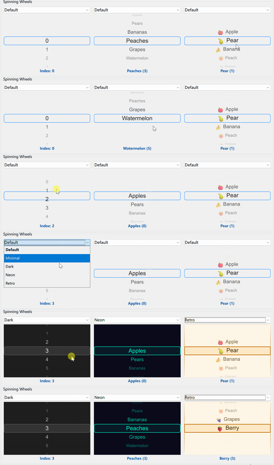
<p>Here is what all three wheels look like in action:</p>

<p><img src="/gai/images/SpinningWheel.gif" alt="SpinningWheel animation" /></p>

<h2 id="date-component-wheels-daypicker-monthpicker-yearpicker">Date component wheels: DayPicker, MonthPicker, YearPicker</h2>

<p>Sometimes you only need to pick a year, a month, or a day. For these cases the library provides dedicated single-wheel components: <code class="language-plaintext highlighter-rouge">YearPicker</code>, <code class="language-plaintext highlighter-rouge">MonthPicker</code>, and <code class="language-plaintext highlighter-rouge">DayPicker</code>.</p>

<ul>
  <li><code class="language-plaintext highlighter-rouge">currentYear</code>, <code class="language-plaintext highlighter-rouge">currentMonth</code>, <code class="language-plaintext highlighter-rouge">currentDay: int</code> — The currently selected year, month, or day.</li>
  <li><code class="language-plaintext highlighter-rouge">range: object</code> — A JavaScript object with <code class="language-plaintext highlighter-rouge">from</code> and <code class="language-plaintext highlighter-rouge">to</code> attributes that defines the allowed range. When the range is changed (by assignment or binding) it is validated (<code class="language-plaintext highlighter-rouge">from ≤ to</code>) and may be rejected. If rejected, a message is printed to the console. If the current selection falls outside the new range it is clamped to the nearest boundary.</li>
  <li><code class="language-plaintext highlighter-rouge">delegate: Component</code> — Custom delegate.</li>
  <li><code class="language-plaintext highlighter-rouge">background: Component</code> — Custom background.</li>
  <li><code class="language-plaintext highlighter-rouge">highlight: Component</code> — Custom highlight.</li>
  <li><code class="language-plaintext highlighter-rouge">locale: Locale</code> — Locale used for month names.</li>
</ul>

<div class="language-qml highlighter-rouge"><div class="highlight"><pre class="highlight"><code><span class="kt">YearPicker</span> <span class="p">{</span>
    <span class="nl">currentYear</span><span class="p">:</span> <span class="mi">2026</span>
    <span class="nl">range</span><span class="p">:</span> <span class="p">({</span> <span class="na">from</span><span class="p">:</span> <span class="mi">2020</span><span class="p">,</span> <span class="na">to</span><span class="p">:</span> <span class="mi">2030</span> <span class="p">})</span>
<span class="p">}</span>

<span class="kt">MonthPicker</span> <span class="p">{</span>
    <span class="nl">currentMonth</span><span class="p">:</span> <span class="mi">5</span>  <span class="c1">// June (0-indexed)</span>
    <span class="nl">range</span><span class="p">:</span> <span class="p">({</span> <span class="na">from</span><span class="p">:</span> <span class="mi">0</span><span class="p">,</span> <span class="na">to</span><span class="p">:</span> <span class="mi">11</span> <span class="p">})</span>
<span class="p">}</span>

<span class="kt">DayPicker</span> <span class="p">{</span>
    <span class="nl">currentDay</span><span class="p">:</span> <span class="mi">15</span>
    <span class="nl">range</span><span class="p">:</span> <span class="p">({</span> <span class="na">from</span><span class="p">:</span> <span class="mi">1</span><span class="p">,</span> <span class="na">to</span><span class="p">:</span> <span class="mi">31</span> <span class="p">})</span>
<span class="p">}</span>
</code></pre></div></div>

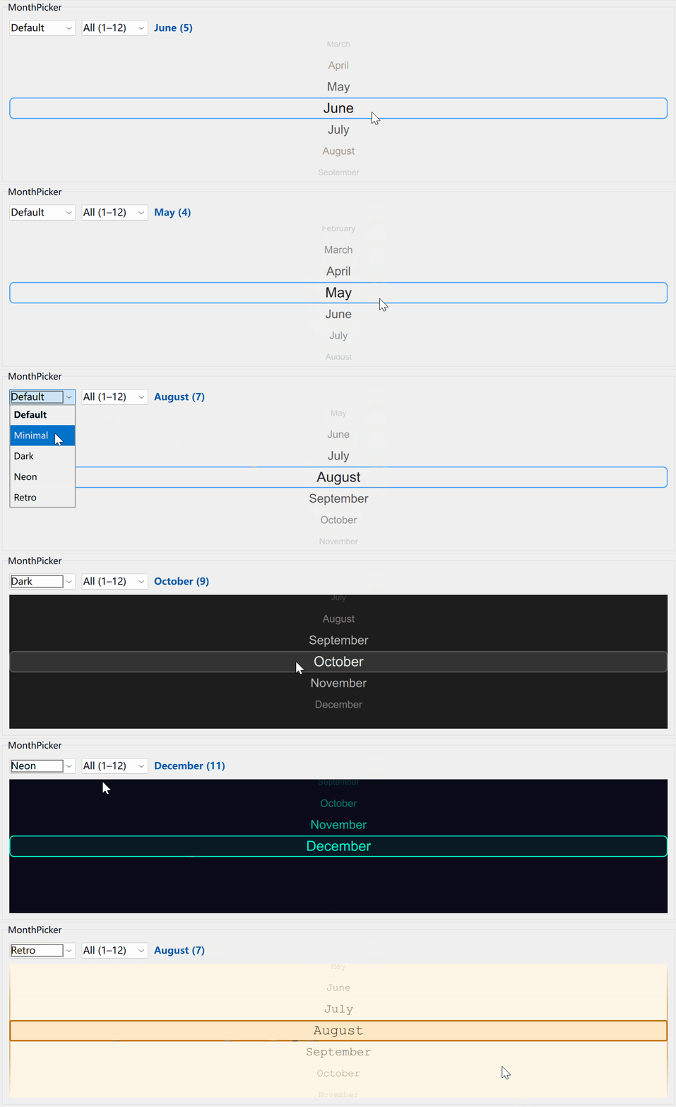
<p>Here is the month picker in action:</p>

<p><img src="/gai/images/MonthPicker.gif" alt="MonthPicker animation" /></p>

<p>Although the individual date wheels are fully self-contained, you will most likely want to use all three together. That is exactly what the date picker component is for.</p>

<h2 id="the-date-picker">The date picker</h2>

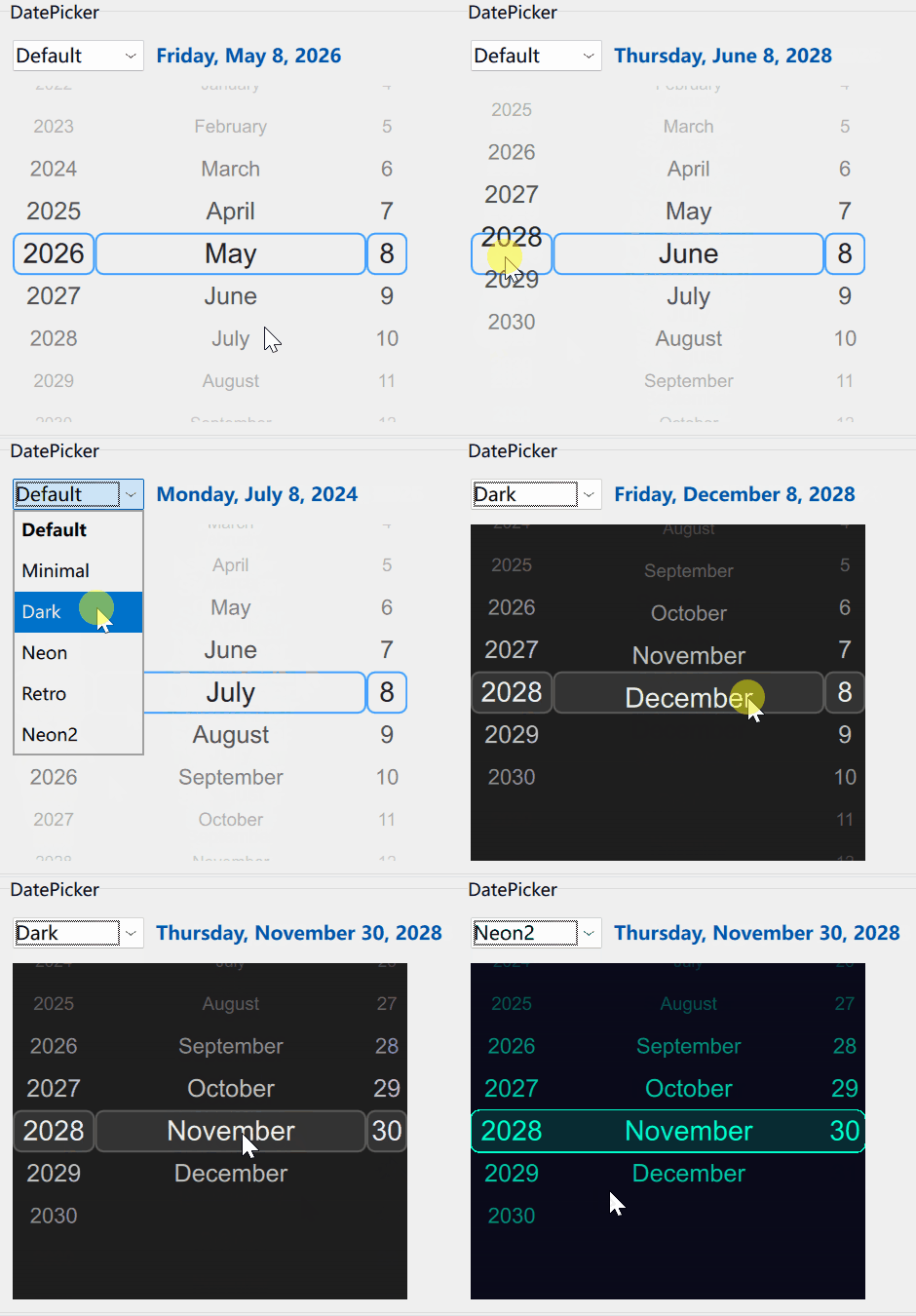
<p>By grouping all three wheels together we get a full date picker component. You can set a date range, and the available range for each wheel is computed dynamically based on the current selection.</p>

<blockquote>
  <p>For example, suppose the end date is 2028-06-06 and the current selection is 2027-05-05 — all twelve months are available in the month wheel. But if the current selection is 2028-05-05 with the same range, the month wheel only shows January through July.</p>
</blockquote>

<p>The number of days in the day wheel is also adjusted automatically based on the selected month and the active date range.</p>

<h3 id="datepicker-properties">DatePicker properties</h3>

<ul>
  <li><code class="language-plaintext highlighter-rouge">selectedDate: date</code> — The currently selected date.</li>
  <li><code class="language-plaintext highlighter-rouge">dateRange: object</code> — The allowed date range (a JavaScript object with <code class="language-plaintext highlighter-rouge">begin</code> and <code class="language-plaintext highlighter-rouge">end</code> attributes).</li>
  <li><code class="language-plaintext highlighter-rouge">locale: Locale</code> — Locale used for month names.</li>
  <li><code class="language-plaintext highlighter-rouge">font: font</code> — Font used by the default delegates. Also used to calculate the width of each wheel so that all years, months, and days fit with some padding.</li>
  <li><code class="language-plaintext highlighter-rouge">delegate: Component</code> — A shared delegate applied to all three wheels.</li>
  <li><code class="language-plaintext highlighter-rouge">background: Component</code> — A shared background applied to each wheel individually.</li>
  <li><code class="language-plaintext highlighter-rouge">highlight: Component</code> — Highlight component applied to all three wheels.</li>
  <li><code class="language-plaintext highlighter-rouge">highlightYear: Component</code> — Highlight component for the year wheel only.</li>
  <li><code class="language-plaintext highlighter-rouge">highlightMonth: Component</code> — Highlight component for the month wheel only.</li>
  <li><code class="language-plaintext highlighter-rouge">highlightDay: Component</code> — Highlight component for the day wheel only.</li>
</ul>

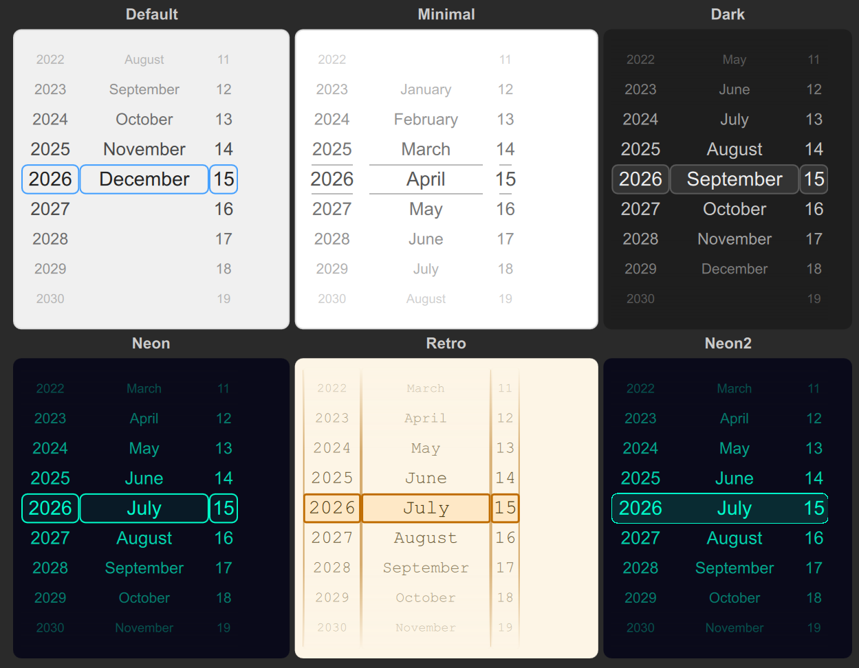
<p>The <code class="language-plaintext highlighter-rouge">highlight</code> property sets a single highlight component for all three wheels at once. The individual properties <code class="language-plaintext highlighter-rouge">highlightYear</code>, <code class="language-plaintext highlighter-rouge">highlightMonth</code>, and <code class="language-plaintext highlighter-rouge">highlightDay</code> let you override the highlight for each wheel separately. Assigning <code class="language-plaintext highlighter-rouge">highlight</code> overwrites all three; assigning an individual property overwrites only the corresponding wheel. This is useful when you want rounded corners on the left edge of the year wheel and the right edge of the day wheel, as in the Neon2 theme.</p>

<h3 id="datepicker-signals">DatePicker signals</h3>

<ul>
  <li><code class="language-plaintext highlighter-rouge">activated(date selected)</code> — Emitted when the user changes the selected date. Not emitted when the date is changed programmatically.</li>
  <li><code class="language-plaintext highlighter-rouge">selectedDateChanged</code> — Emitted whenever the selected date changes, whether by the user or programmatically.</li>
</ul>

<h3 id="basic-usage">Basic usage</h3>

<div class="language-qml highlighter-rouge"><div class="highlight"><pre class="highlight"><code><span class="kt">DatePicker</span> <span class="p">{</span>
    <span class="nl">id</span><span class="p">:</span> <span class="kd">startDatePicker</span>
    <span class="nl">selectedDate</span><span class="p">:</span> <span class="k">new</span> <span class="nb">Date</span><span class="p">(</span><span class="mi">2026</span><span class="p">,</span> <span class="mi">0</span><span class="p">,</span> <span class="mi">1</span><span class="p">)</span>
    <span class="nl">dateRange</span><span class="p">:</span> <span class="p">({</span>
        <span class="na">begin</span><span class="p">:</span> <span class="k">new</span> <span class="nb">Date</span><span class="p">(</span><span class="mi">2020</span><span class="p">,</span> <span class="mi">0</span><span class="p">,</span> <span class="mi">1</span><span class="p">),</span>
        <span class="na">end</span><span class="p">:</span> <span class="k">new</span> <span class="nb">Date</span><span class="p">(</span><span class="mi">2030</span><span class="p">,</span> <span class="mi">11</span><span class="p">,</span> <span class="mi">31</span><span class="p">)</span>
    <span class="p">})</span>
<span class="p">}</span>
</code></pre></div></div>

<p><img src="/gai/images/DatePicker.gif" alt="DatePicker animation" /></p>

<h3 id="themes">Themes</h3>

<p>Themes are not part of the <code class="language-plaintext highlighter-rouge">Gai</code> module itself, but they are straightforward to create. The demo application in <code class="language-plaintext highlighter-rouge">main.qml</code> includes several examples that show the full range of styling options. Below is the Neon theme for <code class="language-plaintext highlighter-rouge">DatePicker</code>. For small projects you can declare the components inline as shown here; in larger codebases it is cleaner to define them as separate <code class="language-plaintext highlighter-rouge">Component</code> objects. The image below shows all six themes side by side.</p>

<div class="language-qml highlighter-rouge"><div class="highlight"><pre class="highlight"><code><span class="k">import</span> <span class="nx">QtQuick</span>
<span class="k">import</span> <span class="nx">QtQuick</span><span class="p">.</span><span class="nx">Window</span>
<span class="k">import</span> <span class="nx">Gai</span>

<span class="kt">Window</span> <span class="p">{</span>
    <span class="nl">id</span><span class="p">:</span> <span class="kd">root</span>
    <span class="nl">width</span><span class="p">:</span> <span class="mi">400</span>
    <span class="nl">height</span><span class="p">:</span> <span class="mi">500</span>
    <span class="nl">visible</span><span class="p">:</span> <span class="kc">true</span>
    <span class="nl">title</span><span class="p">:</span> <span class="dl">"</span><span class="s2">Neon DatePicker</span><span class="dl">"</span>
    <span class="nl">color</span><span class="p">:</span> <span class="dl">"</span><span class="s2">#0a0a1a</span><span class="dl">"</span>

    <span class="c1">// This font is used both for rendering text and for calculating</span>
    <span class="c1">// the width of the year, month, and day wheels.</span>
    <span class="kd">property</span> <span class="kt">font</span> <span class="nl">appFont</span><span class="p">:</span> <span class="nx">Qt</span><span class="p">.</span><span class="nx">font</span><span class="p">({</span> <span class="na">family</span><span class="p">:</span> <span class="dl">"</span><span class="s2">Arial</span><span class="dl">"</span><span class="p">,</span> <span class="na">pointSize</span><span class="p">:</span> <span class="mi">14</span> <span class="p">})</span>

    <span class="kt">DatePicker</span> <span class="p">{</span>
        <span class="nl">anchors.centerIn</span><span class="p">:</span> <span class="nx">parent</span>
        <span class="nl">width</span><span class="p">:</span> <span class="nx">parent</span><span class="p">.</span><span class="nx">width</span> <span class="o">*</span> <span class="mf">0.8</span>
        <span class="nl">height</span><span class="p">:</span> <span class="nx">parent</span><span class="p">.</span><span class="nx">height</span> <span class="o">*</span> <span class="mf">0.8</span>
        <span class="nl">font</span><span class="p">:</span> <span class="nx">root</span><span class="p">.</span><span class="nx">appFont</span>

        <span class="c1">// Initial selection: 15 June 2026</span>
        <span class="nl">selectedDate</span><span class="p">:</span> <span class="k">new</span> <span class="nb">Date</span><span class="p">(</span><span class="mi">2026</span><span class="p">,</span> <span class="mi">5</span><span class="p">,</span> <span class="mi">15</span><span class="p">)</span>
        <span class="c1">// Allowed range: 1 January 2020 – 31 December 2030</span>
        <span class="nl">dateRange</span><span class="p">:</span> <span class="p">({</span> <span class="na">begin</span><span class="p">:</span> <span class="k">new</span> <span class="nb">Date</span><span class="p">(</span><span class="mi">2020</span><span class="p">,</span> <span class="mi">0</span><span class="p">,</span> <span class="mi">1</span><span class="p">),</span> <span class="na">end</span><span class="p">:</span> <span class="k">new</span> <span class="nb">Date</span><span class="p">(</span><span class="mi">2030</span><span class="p">,</span> <span class="mi">11</span><span class="p">,</span> <span class="mi">31</span><span class="p">)</span> <span class="p">})</span>

        <span class="c1">// Delegate that renders each item as text</span>
        <span class="nl">delegate</span><span class="p">:</span> <span class="kt">Text</span> <span class="p">{</span>
            <span class="nl">text</span><span class="p">:</span> <span class="nx">modelData</span>
            <span class="nl">font</span><span class="p">:</span> <span class="nx">root</span><span class="p">.</span><span class="nx">appFont</span>
            <span class="nl">color</span><span class="p">:</span> <span class="dl">"</span><span class="s2">#00ffcc</span><span class="dl">"</span>
            <span class="nl">horizontalAlignment</span><span class="p">:</span> <span class="nx">Text</span><span class="p">.</span><span class="nx">AlignHCenter</span>
            <span class="nl">verticalAlignment</span><span class="p">:</span> <span class="nx">Text</span><span class="p">.</span><span class="nx">AlignVCenter</span>
        <span class="p">}</span>

        <span class="c1">// Background with gradient fade at the top and bottom edges</span>
        <span class="nl">background</span><span class="p">:</span> <span class="kt">Rectangle</span> <span class="p">{</span>
            <span class="nl">color</span><span class="p">:</span> <span class="dl">"</span><span class="s2">#0a0a1a</span><span class="dl">"</span>
            <span class="kt">Rectangle</span> <span class="p">{</span>
                <span class="kt">anchors</span> <span class="p">{</span> <span class="nl">top</span><span class="p">:</span> <span class="nx">parent</span><span class="p">.</span><span class="nx">top</span><span class="p">;</span> <span class="nl">left</span><span class="p">:</span> <span class="nx">parent</span><span class="p">.</span><span class="nx">left</span><span class="p">;</span> <span class="nl">right</span><span class="p">:</span> <span class="nx">parent</span><span class="p">.</span><span class="nx">right</span> <span class="p">}</span>
                <span class="nl">height</span><span class="p">:</span> <span class="nx">parent</span><span class="p">.</span><span class="nx">height</span> <span class="o">*</span> <span class="mf">0.35</span>
                <span class="nl">gradient</span><span class="p">:</span> <span class="kt">Gradient</span> <span class="p">{</span>
                    <span class="kt">GradientStop</span> <span class="p">{</span> <span class="nl">position</span><span class="p">:</span> <span class="mf">0.0</span><span class="p">;</span> <span class="nl">color</span><span class="p">:</span> <span class="dl">"</span><span class="s2">#e00a0a1a</span><span class="dl">"</span> <span class="p">}</span>
                    <span class="kt">GradientStop</span> <span class="p">{</span> <span class="nl">position</span><span class="p">:</span> <span class="mf">1.0</span><span class="p">;</span> <span class="nl">color</span><span class="p">:</span> <span class="dl">"</span><span class="s2">#000a0a1a</span><span class="dl">"</span> <span class="p">}</span>
                <span class="p">}</span>
                <span class="nl">z</span><span class="p">:</span> <span class="mi">1</span>
            <span class="p">}</span>
            <span class="kt">Rectangle</span> <span class="p">{</span>
                <span class="kt">anchors</span> <span class="p">{</span> <span class="nl">bottom</span><span class="p">:</span> <span class="nx">parent</span><span class="p">.</span><span class="nx">bottom</span><span class="p">;</span> <span class="nl">left</span><span class="p">:</span> <span class="nx">parent</span><span class="p">.</span><span class="nx">left</span><span class="p">;</span> <span class="nl">right</span><span class="p">:</span> <span class="nx">parent</span><span class="p">.</span><span class="nx">right</span> <span class="p">}</span>
                <span class="nl">height</span><span class="p">:</span> <span class="nx">parent</span><span class="p">.</span><span class="nx">height</span> <span class="o">*</span> <span class="mf">0.35</span>
                <span class="nl">gradient</span><span class="p">:</span> <span class="kt">Gradient</span> <span class="p">{</span>
                    <span class="kt">GradientStop</span> <span class="p">{</span> <span class="nl">position</span><span class="p">:</span> <span class="mf">0.0</span><span class="p">;</span> <span class="nl">color</span><span class="p">:</span> <span class="dl">"</span><span class="s2">#000a0a1a</span><span class="dl">"</span> <span class="p">}</span>
                    <span class="kt">GradientStop</span> <span class="p">{</span> <span class="nl">position</span><span class="p">:</span> <span class="mf">1.0</span><span class="p">;</span> <span class="nl">color</span><span class="p">:</span> <span class="dl">"</span><span class="s2">#e00a0a1a</span><span class="dl">"</span> <span class="p">}</span>
                <span class="p">}</span>
                <span class="nl">z</span><span class="p">:</span> <span class="mi">1</span>
            <span class="p">}</span>
        <span class="p">}</span>

        <span class="c1">// Highlight indicator for the currently selected item</span>
        <span class="nl">highlight</span><span class="p">:</span> <span class="kt">Rectangle</span> <span class="p">{</span> <span class="nl">color</span><span class="p">:</span> <span class="dl">"</span><span class="s2">#1100ffcc</span><span class="dl">"</span><span class="p">;</span> <span class="nl">border.color</span><span class="p">:</span> <span class="dl">"</span><span class="s2">#00ffcc</span><span class="dl">"</span><span class="p">;</span> <span class="nl">border.width</span><span class="p">:</span> <span class="mi">1</span><span class="p">;</span> <span class="nl">radius</span><span class="p">:</span> <span class="mi">6</span> <span class="p">}</span>
    <span class="p">}</span>
<span class="p">}</span>
</code></pre></div></div>

<p><img src="/gai/images/ThemesCompare.png" alt="All themes" /></p>

<h2 id="integrating-datepicker-into-your-project">Integrating DatePicker into your project</h2>

<p>The components were developed and tested with:</p>

<ul>
  <li>Qt 6.x (Core, Gui, Quick, Qml modules);</li>
  <li>CMake 3.16 or higher;</li>
  <li>A C++17-compatible compiler.</li>
</ul>

<p>They may also work with earlier or later versions.</p>

<p>The repository is structured as follows:</p>

<div class="language-plaintext highlighter-rouge"><div class="highlight"><pre class="highlight"><code>DatePickerDemo/
├── qml/
│   └── main.qml              # Demo application UI
├── src/
│   └── main.cpp              # Application entry point
├── imports/
│   └── Gai/
│       ├── SpinningWheel.qml # Base spinning wheel component
│       ├── DatePicker.qml    # Main date picker component
│       ├── YearPicker.qml    # Year selection component
│       ├── MonthPicker.qml   # Month selection component
│       ├── DayPicker.qml     # Day selection component
│       ├── qmldir            # QML module definition
│       └── CMakeLists.txt    # Build configuration
├── CMakeLists.txt            # Project build configuration
├── DatePickerDemo.qmlproject # Qt Design Studio project file
├── qtquickcontrols2.conf     # Qt Quick Controls configuration
└── resources.qrc             # Resource file
</code></pre></div></div>

<p>The <code class="language-plaintext highlighter-rouge">imports</code> folder contains the <code class="language-plaintext highlighter-rouge">Gai</code> QML module, which provides all the components. The module includes a <code class="language-plaintext highlighter-rouge">qmldir</code> file for Qt Design Studio and a <code class="language-plaintext highlighter-rouge">CMakeLists.txt</code> for building. Copy the <code class="language-plaintext highlighter-rouge">Gai</code> folder into your project and link the module:</p>

<div class="language-cmake highlighter-rouge"><div class="highlight"><pre class="highlight"><code><span class="nb">add_subdirectory</span><span class="p">(</span>imports/Gai<span class="p">)</span>
<span class="nb">target_link_libraries</span><span class="p">(</span>&lt;your-target-name&gt; PRIVATE
    Gaiplugin
<span class="p">)</span>
</code></pre></div></div>

<blockquote>
  <p>A note on <code class="language-plaintext highlighter-rouge">qmldir</code>: the primary way to use the module is to build it as a static library with all QML files embedded in its resources. In that case CMake generates its own <code class="language-plaintext highlighter-rouge">qmldir</code> inside the resources, so the <code class="language-plaintext highlighter-rouge">qmldir</code> file in the repository is not used at runtime. However, Qt Design Studio needs to read the module’s exported components from a local <code class="language-plaintext highlighter-rouge">qmldir</code> file when you open the project in the IDE. There are of course other deployment options — QML modules can live on the local filesystem or even on a network — but they are not covered by this repository.</p>
</blockquote>

<p>Import the <code class="language-plaintext highlighter-rouge">Gai</code> module wherever you want to use the components:</p>

<div class="language-qml highlighter-rouge"><div class="highlight"><pre class="highlight"><code><span class="k">import</span> <span class="nx">Gai</span>
<span class="kt">Item</span> <span class="p">{</span>
    <span class="kt">DatePicker</span> <span class="p">{</span>
        <span class="nl">selectedDate</span><span class="p">:</span> <span class="k">new</span> <span class="nb">Date</span><span class="p">(</span><span class="mi">2026</span><span class="p">,</span> <span class="mi">0</span><span class="p">,</span> <span class="mi">1</span><span class="p">)</span>
        <span class="nl">dateRange</span><span class="p">:</span> <span class="p">({</span>
            <span class="na">begin</span><span class="p">:</span> <span class="k">new</span> <span class="nb">Date</span><span class="p">(</span><span class="mi">2020</span><span class="p">,</span> <span class="mi">0</span><span class="p">,</span> <span class="mi">1</span><span class="p">),</span>
            <span class="na">end</span><span class="p">:</span> <span class="k">new</span> <span class="nb">Date</span><span class="p">(</span><span class="mi">2030</span><span class="p">,</span> <span class="mi">11</span><span class="p">,</span> <span class="mi">31</span><span class="p">)</span>
        <span class="p">})</span>
    <span class="p">}</span>
<span class="p">}</span>
</code></pre></div></div>

<p>That is all it takes to add the module to your project and enable live preview in Qt Design Studio.</p>

<h2 id="conclusion">Conclusion</h2>

<p>We have covered why and how to use a QML date picker, how it is built internally, and how to integrate it into your own project. We looked at customizing its appearance and behavior, and walked through the integration steps. The component is a good fit for user profile forms, booking flows, event planning applications, and any other context where a date needs to be selected.</p>

<p>Future development could include time selection support and additional customization options. If you have ideas for improving the component, feel free to open an issue or submit a pull request. Thanks for reading!</p>]]></content><author><name>钙</name></author><category term="date-picker" /><category term="qml" /><summary type="html"><![CDATA[There are different approaches to building date picker components in a user interface. For example, Qt6 provides the MonthGrid component, which looks like a calendar: to pick a date, the user selects a year and month and then taps a day in the grid. A more modern approach is based on three spinning wheels — one each for the year, month, and day. This reduces the need for precise clicks: the user can swipe, drag, or scroll the mouse wheel without worrying about exact pointer placement, making date selection faster and more comfortable. The component works equally well in desktop, web, and mobile applications. A ready-made solution is available in the Felgo component library — if you are comfortable pulling in a large third-party dependency with many tightly coupled components. But if you need a minimal yet fully functional implementation that can be dropped straight into your project, this article is for you. If you prefer to jump straight to the code, head over to the repository. Otherwise, read on — I will explain how the component works and how to build on top of it. SpinningWheel — the base spinning wheel component The foundation of the picker is the SpinningWheel component. It implements a single spinning wheel that displays arbitrary data. The user can select an item by clicking, scrolling, or dragging. The component accepts any type of data model: numeric, ListModel, JavaScript array, or QAbstractItemModel, and supports custom background, highlight, and delegate components. For numeric models and JavaScript arrays the default delegate is sufficient. For more complex models such as ListModel or QAbstractItemModel — which expose multiple roles — a custom delegate is required. Let us look at examples using each model type. All components are part of the Gai QML module, which lives in the imports/Gai folder of the repository. SpinningWheel properties model: var — Data model (numeric, JavaScript array, ListModel, or QAbstractItemModel). currentIndex: int — Currently selected index, zero-based. delegate: Component — Delegate for rendering items. The default delegate renders a Text element. highlight: Component — Component used to highlight the current item. background: Component — Background component. font: font — Font used by the default delegate. SpinningWheel signals activated(int index) — Emitted when the user changes the current selection. Not emitted when the selection is changed programmatically. currentIndexChanged — Emitted whenever the current selection changes, whether by the user or programmatically. A simple wheel with a numeric model With a numeric model the default delegate renders numbers from 0 to N-1, where N is the value of the model property. SpinningWheel { id: wheel1 font: Qt.font({ family: "Arial", pointSize: 14 }) model: 10 } The delegate, background, and highlight are all optional. If omitted, the defaults are used. A wheel with a JavaScript array model With an array model every element of the array is placed on the wheel. SpinningWheel { id: wheel2 font: Qt.font({ family: "Arial", pointSize: 14 }) model: ["Apples", "Pears", "Bananas", "Peaches", "Grapes", "Watermelon"] } A wheel with a ListModel When using a role-based model (ListModel or QAbstractItemModel) the default delegate cannot render the items correctly, so a custom delegate is required. In the example below the model has two roles; they are accessible in the delegate as model.role_name. SpinningWheel { id: wheel3 font: Qt.font({ family: "Arial", pointSize: 14 }) model: ListModel { ListElement { emoji: "🍎"; label: "Apple" } ListElement { emoji: "🍐"; label: "Pear" } ListElement { emoji: "🍌"; label: "Banana" } ListElement { emoji: "🍑"; label: "Peach" } ListElement { emoji: "🍇"; label: "Grapes" } ListElement { emoji: "🍓"; label: "Berry" } } delegate: Item { width: parent ? parent.width : 0 height: parent ? parent.height : 0 property color textColor: "#222" Row { anchors.centerIn: parent spacing: 6 Text { text: model.emoji; font.pointSize: 14; verticalAlignment: Text.AlignVCenter } Text { text: model.label; font: root.font; color: parent.parent.textColor; verticalAlignment: Text.AlignVCenter } } } } Here is what all three wheels look like in action: Date component wheels: DayPicker, MonthPicker, YearPicker Sometimes you only need to pick a year, a month, or a day. For these cases the library provides dedicated single-wheel components: YearPicker, MonthPicker, and DayPicker. currentYear, currentMonth, currentDay: int — The currently selected year, month, or day. range: object — A JavaScript object with from and to attributes that defines the allowed range. When the range is changed (by assignment or binding) it is validated (from ≤ to) and may be rejected. If rejected, a message is printed to the console. If the current selection falls outside the new range it is clamped to the nearest boundary. delegate: Component — Custom delegate. background: Component — Custom background. highlight: Component — Custom highlight. locale: Locale — Locale used for month names. YearPicker { currentYear: 2026 range: ({ from: 2020, to: 2030 }) } MonthPicker { currentMonth: 5 // June (0-indexed) range: ({ from: 0, to: 11 }) } DayPicker { currentDay: 15 range: ({ from: 1, to: 31 }) } Here is the month picker in action: Although the individual date wheels are fully self-contained, you will most likely want to use all three together. That is exactly what the date picker component is for. The date picker By grouping all three wheels together we get a full date picker component. You can set a date range, and the available range for each wheel is computed dynamically based on the current selection. For example, suppose the end date is 2028-06-06 and the current selection is 2027-05-05 — all twelve months are available in the month wheel. But if the current selection is 2028-05-05 with the same range, the month wheel only shows January through July. The number of days in the day wheel is also adjusted automatically based on the selected month and the active date range. DatePicker properties selectedDate: date — The currently selected date. dateRange: object — The allowed date range (a JavaScript object with begin and end attributes). locale: Locale — Locale used for month names. font: font — Font used by the default delegates. Also used to calculate the width of each wheel so that all years, months, and days fit with some padding. delegate: Component — A shared delegate applied to all three wheels. background: Component — A shared background applied to each wheel individually. highlight: Component — Highlight component applied to all three wheels. highlightYear: Component — Highlight component for the year wheel only. highlightMonth: Component — Highlight component for the month wheel only. highlightDay: Component — Highlight component for the day wheel only. The highlight property sets a single highlight component for all three wheels at once. The individual properties highlightYear, highlightMonth, and highlightDay let you override the highlight for each wheel separately. Assigning highlight overwrites all three; assigning an individual property overwrites only the corresponding wheel. This is useful when you want rounded corners on the left edge of the year wheel and the right edge of the day wheel, as in the Neon2 theme. DatePicker signals activated(date selected) — Emitted when the user changes the selected date. Not emitted when the date is changed programmatically. selectedDateChanged — Emitted whenever the selected date changes, whether by the user or programmatically. Basic usage DatePicker { id: startDatePicker selectedDate: new Date(2026, 0, 1) dateRange: ({ begin: new Date(2020, 0, 1), end: new Date(2030, 11, 31) }) } Themes Themes are not part of the Gai module itself, but they are straightforward to create. The demo application in main.qml includes several examples that show the full range of styling options. Below is the Neon theme for DatePicker. For small projects you can declare the components inline as shown here; in larger codebases it is cleaner to define them as separate Component objects. The image below shows all six themes side by side. import QtQuick import QtQuick.Window import Gai Window { id: root width: 400 height: 500 visible: true title: "Neon DatePicker" color: "#0a0a1a" // This font is used both for rendering text and for calculating // the width of the year, month, and day wheels. property font appFont: Qt.font({ family: "Arial", pointSize: 14 }) DatePicker { anchors.centerIn: parent width: parent.width * 0.8 height: parent.height * 0.8 font: root.appFont // Initial selection: 15 June 2026 selectedDate: new Date(2026, 5, 15) // Allowed range: 1 January 2020 – 31 December 2030 dateRange: ({ begin: new Date(2020, 0, 1), end: new Date(2030, 11, 31) }) // Delegate that renders each item as text delegate: Text { text: modelData font: root.appFont color: "#00ffcc" horizontalAlignment: Text.AlignHCenter verticalAlignment: Text.AlignVCenter } // Background with gradient fade at the top and bottom edges background: Rectangle { color: "#0a0a1a" Rectangle { anchors { top: parent.top; left: parent.left; right: parent.right } height: parent.height * 0.35 gradient: Gradient { GradientStop { position: 0.0; color: "#e00a0a1a" } GradientStop { position: 1.0; color: "#000a0a1a" } } z: 1 } Rectangle { anchors { bottom: parent.bottom; left: parent.left; right: parent.right } height: parent.height * 0.35 gradient: Gradient { GradientStop { position: 0.0; color: "#000a0a1a" } GradientStop { position: 1.0; color: "#e00a0a1a" } } z: 1 } } // Highlight indicator for the currently selected item highlight: Rectangle { color: "#1100ffcc"; border.color: "#00ffcc"; border.width: 1; radius: 6 } } } Integrating DatePicker into your project The components were developed and tested with: Qt 6.x (Core, Gui, Quick, Qml modules); CMake 3.16 or higher; A C++17-compatible compiler. They may also work with earlier or later versions. The repository is structured as follows: DatePickerDemo/ ├── qml/ │ └── main.qml # Demo application UI ├── src/ │ └── main.cpp # Application entry point ├── imports/ │ └── Gai/ │ ├── SpinningWheel.qml # Base spinning wheel component │ ├── DatePicker.qml # Main date picker component │ ├── YearPicker.qml # Year selection component │ ├── MonthPicker.qml # Month selection component │ ├── DayPicker.qml # Day selection component │ ├── qmldir # QML module definition │ └── CMakeLists.txt # Build configuration ├── CMakeLists.txt # Project build configuration ├── DatePickerDemo.qmlproject # Qt Design Studio project file ├── qtquickcontrols2.conf # Qt Quick Controls configuration └── resources.qrc # Resource file The imports folder contains the Gai QML module, which provides all the components. The module includes a qmldir file for Qt Design Studio and a CMakeLists.txt for building. Copy the Gai folder into your project and link the module: add_subdirectory(imports/Gai) target_link_libraries(&lt;your-target-name&gt; PRIVATE Gaiplugin ) A note on qmldir: the primary way to use the module is to build it as a static library with all QML files embedded in its resources. In that case CMake generates its own qmldir inside the resources, so the qmldir file in the repository is not used at runtime. However, Qt Design Studio needs to read the module’s exported components from a local qmldir file when you open the project in the IDE. There are of course other deployment options — QML modules can live on the local filesystem or even on a network — but they are not covered by this repository. Import the Gai module wherever you want to use the components: import Gai Item { DatePicker { selectedDate: new Date(2026, 0, 1) dateRange: ({ begin: new Date(2020, 0, 1), end: new Date(2030, 11, 31) }) } } That is all it takes to add the module to your project and enable live preview in Qt Design Studio. Conclusion We have covered why and how to use a QML date picker, how it is built internally, and how to integrate it into your own project. We looked at customizing its appearance and behavior, and walked through the integration steps. The component is a good fit for user profile forms, booking flows, event planning applications, and any other context where a date needs to be selected. Future development could include time selection support and additional customization options. If you have ideas for improving the component, feel free to open an issue or submit a pull request. Thanks for reading!]]></summary></entry></feed>